The printed colour doesn’t match the colour I see on my monitor?
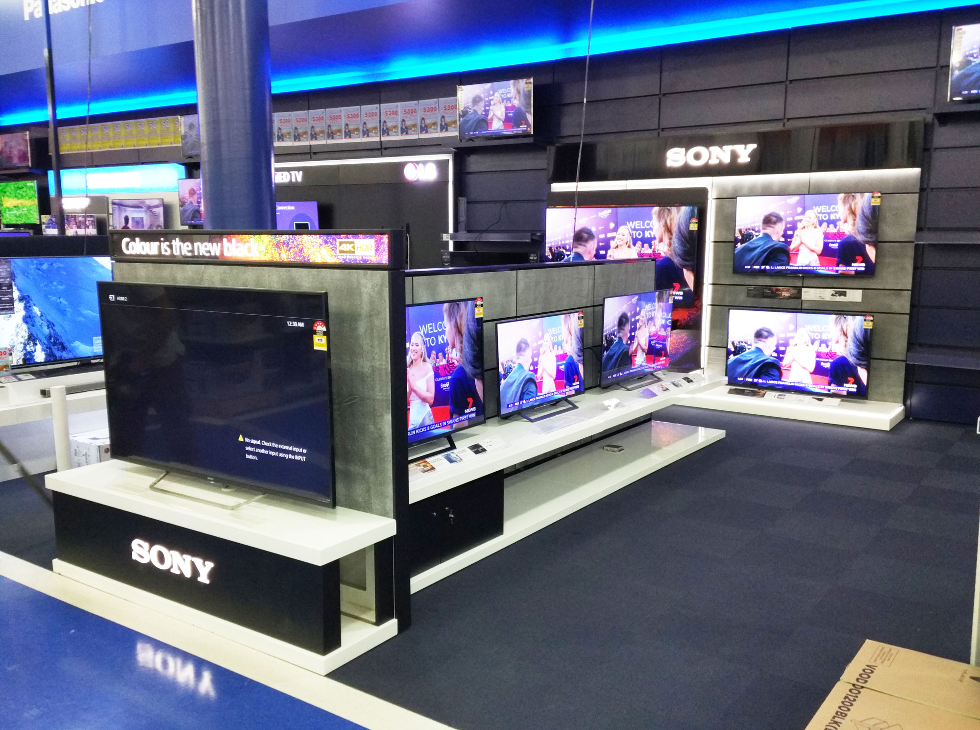
A common question we get asked a lot. There can of course be many factors which contribute to the colour you see on your monitor, each monitor is calibrated differently. If you have ever walked in to any electronic store and looked at all the televisions, each displaying the same video but each one looks slightly different, some have darker blacks, richer colours, brighter whites, more contrast. Every TV monitor varies – this is due to the screen type, contrast ratio, calibration and even the lighting in the room can change the appearance. Your monitor is rather like a television, what you see on your screen will be different to what I see on my screen.

There is another HUGE factor too though…
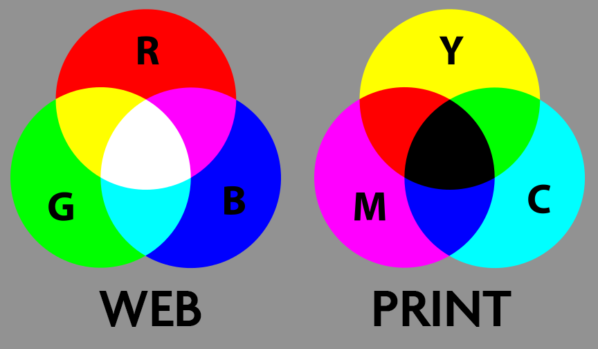
A monitor starts in a BLACK state and is then illuminated with Red, Green and Blue lights to produce the millions of colours you see. When it comes to print of course, the paper starts off as a white sheet of paper and then Cyan, Magenta, Yellow and Black ink is applied to make the millions of different colours. So 2 totally different methods of producing colour.

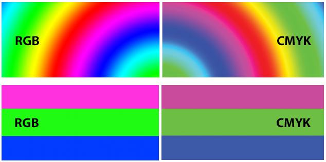
We will try to best match what you want to achieve but if you are working in RGB (Red, Green, Blue) you will see that some of these colours are not possible to reproduce using CMYK (Cyan, Magenta, Yellow and Black). With a monitor, the more light you shine the whiter the colour you see, in print the more ink you apply, the darker the colour will print.

So what can you do?
Calibrating your monitor can help. To do this, grab a leaflet, business card or whatever we have printed and open the PDF proof you received from us. You then need to start calibrating your monitor to best match the colour you see in print to the colour you see on your screen.
Will this make everything better?
Unfortunately not… it will help but the type of paper we print onto varies, we offer a whole range of paper finishes, Coated paper, Glossy, Silk, and uncoated stock, you can then choose to laminate them, gloss or matt or even a soft touch lamination. Each combination will effect the final colour.
Generally, if we print a business card on a 400gsm silk art board, this is a coated card, the ink is absorbed differently to say printing onto a letterhead, our uncoated leaflet or one of our postcards, these are all on an uncoated stock so when ink is applied the paper absorbs more ink meaning the colour can look denser, sometimes slightly darker than what you see on your business card.
I need my colour to be accurate – what can I do?
If it is critical that the colours match then speak to us about sending colour test sheets on the same stock as you require. We can produce these in small quantities meaning these are an affordable and accurate option.
If you need more information or want to discuss your next project in more detail than arrange a meeting with us and we’ll be happy to offer any advice, suggestions and help in any way we can.

