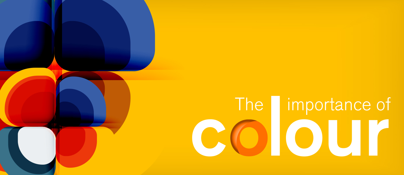
The Meaning of Colour
In today’s blog we are diving into the interesting world of colour. What colour means, why it’s important to business and branding and what you should know about colour when it comes to printed marketing materials.
Colour Theory and Symbolism
As print specialists, we’re very interested in colour. Not just how visually appealing colours can look but the psychology behind certain colours. Yes, we’re big colour nerds and you should be too.
When we’re talking about colour, what we discuss below can be applied to all sorts of design work – from interiors to fashion design. Seen as we deal primarily with graphic design and print services, we are going to look specifically at company branding and printed marketing materials. To have a good understanding of how colours are used, or even to be able to choose colours that look together, an understanding of colour theory and symbolism can come in handy:
Colour theory is used in all visual arts and is a system that most designers refer to when mixing colours, combining colours and the effects those colours have on each other. Ever seen a colour combination that looked hideous? A good designer wouldn’t let that happen as colour theory is incredibly important when it comes to creating something that is visually pleasing.
A colour wheel is commonly used when it comes to creating combinations and there are certain rules that need to be applied to colour. Just in case you’re feeling rebellious and are thinking; ‘but why should I follow the rules?!’, the rules exist because they work.
Now, colour symbolism is a little vaguer but, in a nutshell, it’s a concept whereby all colours symbolise something. It can be difficult to pin colours to a time or place because at different periods in history, and even in the same places but in different cultures, the same colours can have varied meanings.
So, it’s not exact but one aspect of colour symbolism that does have some scientific backing, is how humans perceive colour, the effect it can have on us and what we associate with certain colours. For example;
The colour red is often associated with love or lust and is also used to signify danger. From Valentine’s Day cards to stop signs, red is commonly used for these purposes and we all know what it signifies it its context.
Black, so long the favourite colour of goths all over the world, is commonly associated with death or grief. Hence, why it’s traditional to wear black at funerals in Western culture. Visually though, black can look very stylish, especially when paired with a contrasting colour.
Green is seen as symbolising nature and can have a calming effect on a person. Blue is associated with reliability and so on. Colour symbolism really is quite fascinating, and we could talk about it all day but let’s move onto why colour is important in business and print.


Why Colour Matters in Business
Your company brand and logo are visual markers of what your business stands for. What are your beliefs, if you were a person what would you be like, and how do you want people to perceive you?
Colour is part of your brand identity and as such, it’s important to get your colour selection right and feel happy that it’s a good visual representation of your values. Want your brand to be memorable? Then choose a surprising colour combination.
A good example is Swedish furniture and homeware retailer, IKEA. Their iconic blue and yellow palette is recognisable to most people – even if you can’t see the logo.
This careful use of colour can be seen right across the brands we know and love. Think of Coca Cola and their bold and exciting red. Barbie, have for a long time used a specific shade of pink. It might be outdated now, but since the start of the 20th century, pink has been associated with all things feminine and girly – prior to that it was a ‘boy’s colour’!
As mentioned, blue has long symbolised reliability, especially darker blues and what type of companies do you think want you to believe that they’re always reliable? That’s right, car manufacturers. As seen in the blue logos of Ford, BMW, VW and Subaru.
The above are just a few examples of how colour is used by designers and marketers, can you think of more?
Colour and Printed Marketing Materials
When it comes to designing marketing materials such as brochures, flyers or banners, the use of colour should be carefully considered.
For example, using white text on black can be quite difficult to read when printed, especially if the font size is quite small.
Print materials need to be designed with print in mind, or at least converted to print ready versions as colours can really vary between what you see on a screen and what you see in real life. This is because different systems are used to translate colour;
Screen colours are usually RGB (red-green-blue) or Hex (hexadecimal), and print colours should be CMYK (cyan-magenta-yellow-key/black) or the less commonly used Spot Colour/PMS. That’s an entirely different topic though and we’ll save that for another time!
Get in Touch
If you need advice on branding or printed materials, please get in touch. From branding and graphic design, through to finished print materials, we can help with all aspects of branding.